Data Visualization
Designed for ideal information readability & readability.
Organizing Information →
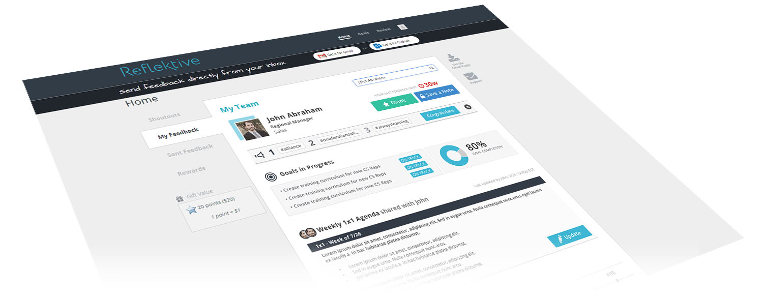
Freelanced with Reflektive, Inc. in 2016, a performance management platform company, to work with product designers to ideate and design the Employee Profile Page.
Designed for ideal information readability & readability.
Organizing Information →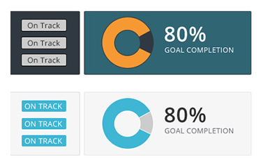
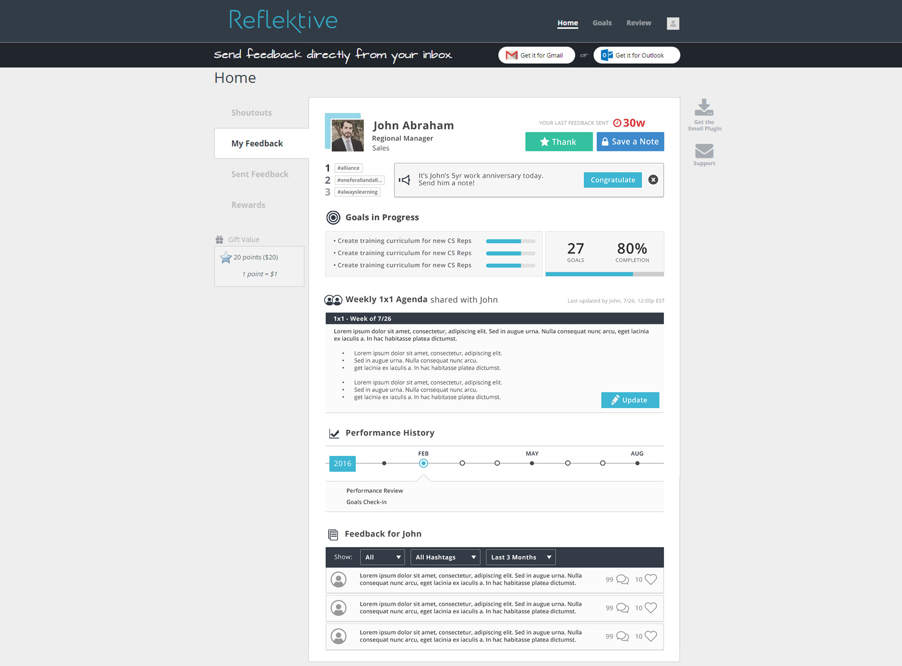
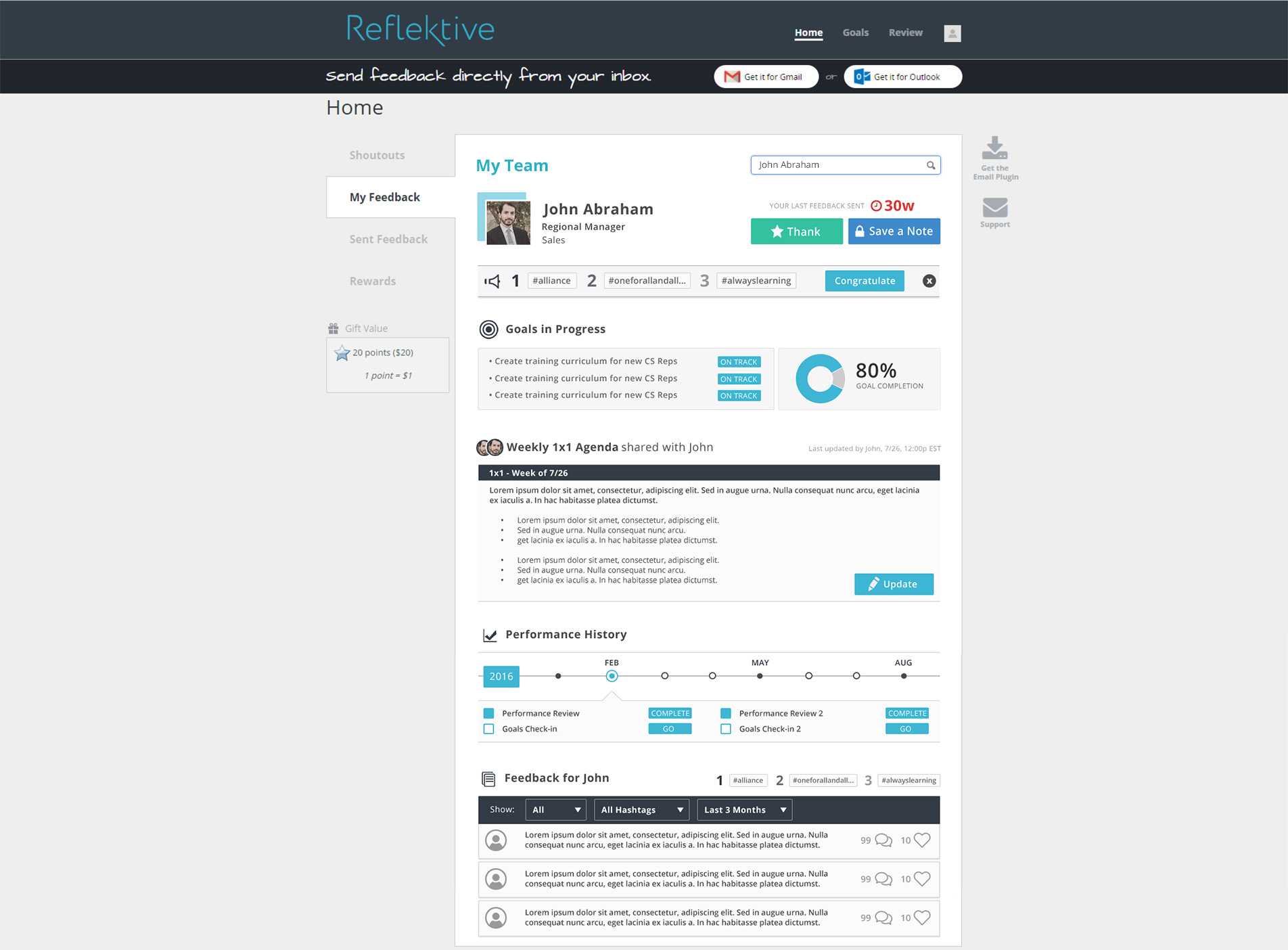
The page needs to show information about the employee, reoccuring feedback tags, personal goals, agenda, performance history, and feedback sections. This is a performance management system so the POV is the POV of the manager looking at an employee's profile page.
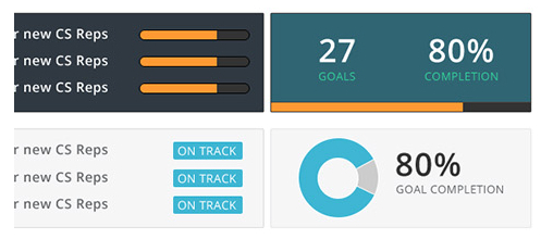
I needed a way to indicate the tasks/goals and the progress of their completion. Rather than inundate the viewer with too many progress bars, we decided to just have an "on track" indicator and one progress circle as the main view.
This was just early exploration of the layout however, the color choices are very intentional.
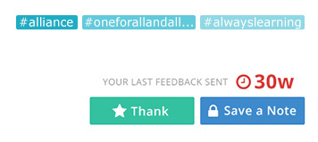 Reds grab your attention first which is being used to inform the user that feedback needs to be sent.
Greens are always associated with affirmative or positive actions, in this case, I use it for "Thanks"
Blues are typically side information. In this case I am using it for the optional "Save a Note" and hashtags the employee has been tagged with in order of most used hashtags to least used.
Originally I considered the teal, orange, and black combo for a bold, attention catching part of the UI, but it was a bit too strong, so I opted for something a bit more neutral.
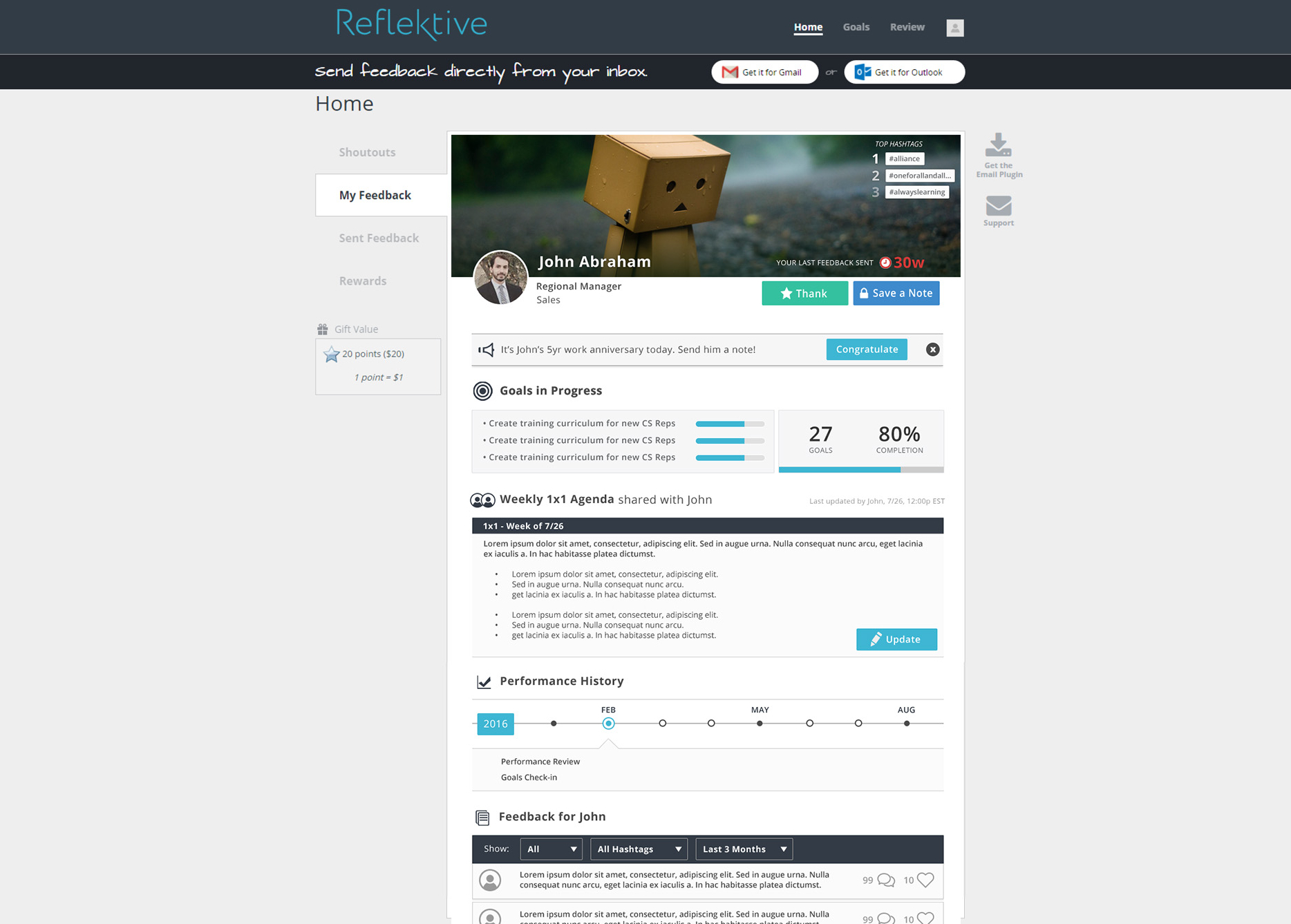
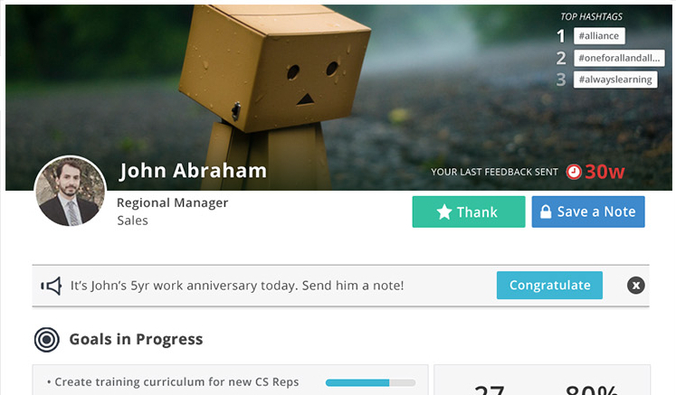
I had general requirements for the content, but less so the layout so I had the opportunity to experiment with different designs. For example, I wanted to try out letting users customize their profile banners in hopes that it would make employees feel more invested in the system
It was a bit too casual for the performance management platform though so you can see the progression leading up to version 3 in the images below.